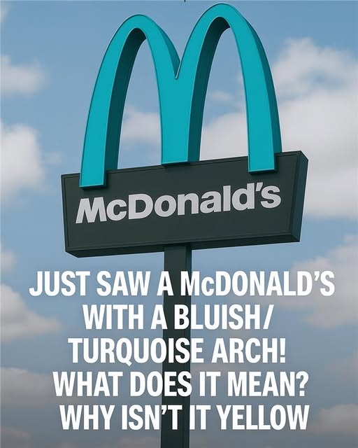
When McDonald’s tried to move into this tiny desert town, something unexpected happened. The town pushed back. Hard. Their demand? Change one of the most powerful corporate symbols on Earth — or don’t come at all. What followed was a tense negotiation between global branding and local identity, ending with arches that weren’t gold, but a soft turqu
In Sedona, Arizona, the red rocks and desert sky aren’t just scenery — they’re identity. City leaders feared McDonald’s bright yellow arches would slice through that landscape like a billboard, shattering the town’s carefully protected visual harmony. Instead of backing down or steamrolling local rules, McDonald’s did something almost unthinkable for a global giant: it bent. The arches stayed, but the gold disappeared.
Turquoise, a color woven into the cultural and spiritual fabric of the Southwest, became the compromise. The familiar “M” remained instantly recognizable, yet now it echoed the sky, the jewelry, and the desert tones around it. Locals saw respect rather than intrusion. Tourists saw a small miracle of design restraint. Those turquoise arches quietly proved that powerful brands don’t have to look identical everywhere to be themselves — and that when corporations listen, communities don’t just tolerate them; they often embrace them.